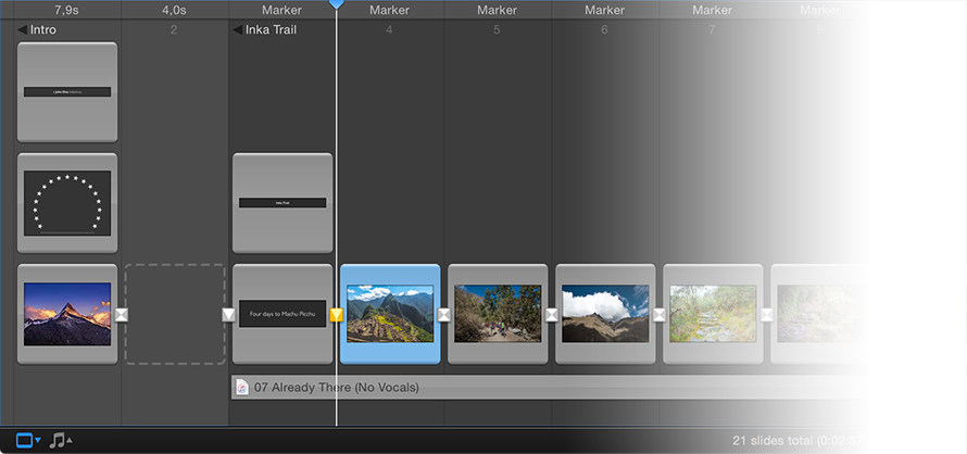
Working with the Storyboard/Timeline
At the bottom of a FotoMagico document window you can see the Storyboard or the Timeline. The Storyboard and Timeline display your slideshow data. They allow you to create and edit your slideshow. You can use both views to perform most of the same functions, however, some tasks are easier to achieve in one view than the other. You can only display one view at a time. Use the Storyboard button or the Timeline button to toggle between the two views. You can also toggle between the two views by choosing the appropriate menu commands from the menu.
The Storyboard is generally used for adding and rearranging slides (image, movies, titles) or audio. The Timeline on the other hand is helpful for fine-tuning the duration of slides and transitions, and editing audio items by using the audio waveform feature.
In addition, you can perform most of the same actions by clicking somewhere in the Storyboard or Timeline, selecting from the menu, or working in the Options Inspector; but often they are easier to achieve by clicking directly in the Storyboard/Timeline. If you want to change parameters for a multiple selection however, then you must use the Options Inspector.
Please note that the Timeline mode - and all the features it makes possible - is only available in FotoMagico Pro.
When to Use Storyboard View
Storyboard view is very useful to help start your slideshow by dragging images from the Image Browser to the Storyboard, and for rearranging slides by dragging them within the Storyboard.
Slides are displayed as the same size square frames (which always takes up the same amount of space, regardless of the duration). You can see a larger number of slides at the same time, so you get a better overview. This is useful when adding new slides or rearranging slides via drag & drop.
Thumbnails of images, movies, and titles are large enough, so that you can recognize each photo.
When to Use Timeline View
Timeline view allows you to be more precise and is best for fine-tuning slides and transition durations.
You can see fewer slides, but you can see more properties for each item in the Timeline.
The Timeline view depicts slides as rectangular bars with the width being proportional to the duration. The transition interval, where both the incoming and outgoing slides overlap, is drawn as a “stairstep” shape. Dragging the lower left edge of this interval allows you to change the slide duration, while dragging the upper right edge allows you to change the transition duration.
The Timeline view also provides an audio waveform display which allows you to locate an exact position in a song.
Audio markers are used to synchronize slide transitions with the beat of the music by placing a marker at an exact location in the audio. Using audio markers along with the audio waveform helps to visually place the marker on the beat of the music. Audio markers display as a vertical red line on top of the waveform.
For more information, see Adjusting Timing in the Timeline and Audio Markers.
When an audio item is selected, it displays the volume envelope and fades as a yellow line. Drag the left edge of an audio item to change its fade-in offset. Drag the little square dots on the yellow line to change the fade-in or fade-out durations. Drag the right edge to change the fade-out offset. Dragging the line itself changes the volume, while Cmd-clicking on the line adds or removes a volume envelope point.
For more information, see Controlling Audio Volume.
Drag & Drop in the Storyboard/Timeline
Dragging slides into the Storyboard behaves differently, depending on whether you drag a single item or drag multiple items. A yellow highlight indicates where the dragged items will end up when being dropped. Depending on which and how many items you drag to the Storyboard, you may have the following options:
- You can insert the dragged items between existing slides
- You can add new layers to an existing slide
- You can replace the media files of existing items
- In case of snippets with placeholders, replacing is the most common case
About Tracks in Storyboard/Timeline
Using multiple tracks requires quite a bit of vertical space in the Storyboard/Timeline, which might present a problem on smaller notebook screens (for example, on a MacBook Air). For this reason, you can expand and collapse the visual and audio tracks. Click the Visual or Audio track icon in the lower left corner of the window (below the Storyboard/Timeline) to expand or collapse the tracks.
Blue indicates the track is expanded, grey indicates the track is collapsed. The same commands are also available in the menu. When visual tracks are collapsed, the layers are displayed as a stack of frames, which auto-expand when hovering over the stack.
Inline Authoring Help in Storyboard/Timeline
Virtually all icons that appear on various items in the Storyboard/Timeline can be clicked to reveal a popover that communicates a notice or some kind of issue. The popover explains the situation and offers buttons with potential solutions. Yellow warning icons usually communicate a serious issue, that should be fixed, while the white note icon simply communicates a situation that you may want to act on, but you do not have to.


